Pages

Wednesday, February 4, 2015

Pirates and Contests

There's this group on Facebook that is essentially a design competition.
So I joined, thinking it would be a good exercise.
First month's theme is Pirates.

I'm really intimidated.
Because everyone's submitting this really awesome stuff and all I've got is this SoB.
He... ugh I can do so much better than this.
His character is far more interesting when he isn't all dolled up for the sake of looking "piratey."
He normally doesn't have as many tattoos, wears much lighter shoes, and his headband is usually a thin gold band.
The monkey isn't even his, I pretty sure he's borrowing it from his captain to try to get in someone's pants.
He's a faerie pirate, hence the wings. He isn't the captain of his boat but many believe he owns it due to his wealth which he may or may not have obtained from his many rich ... suitors.
His good looks rarely go unused as he is incredibly talented at convincing people to do what he wants.

Pretty much what I wanted to do was change up the usual dynamic-looking male characters and standard-issue pretty female characters by making a pretty male character.

Maybe next month will have something I can make a creature out of.
And maybe I'll show that I'm actually competent.

Luckily I forgot to turn this one in on time, so maybe I can spare my dignity a while longer.
~Allie

Wednesday, December 31, 2014

Your (Ir)Regularly Scheduled Update

I've been informed that I've done a poor job of keeping this blog interesting.
My bad.

Guess now's a good a time as ever to do a review type thing, excluding that which I've already posted here. (Plus my plans for the New Year consist of watching Enchanted and pretending that I'm going to do something productive before the semester starts.)
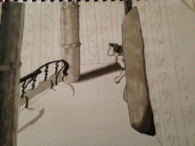
Plus I promised an update on this:
I finished this a while back, but forgot to let you guys know.

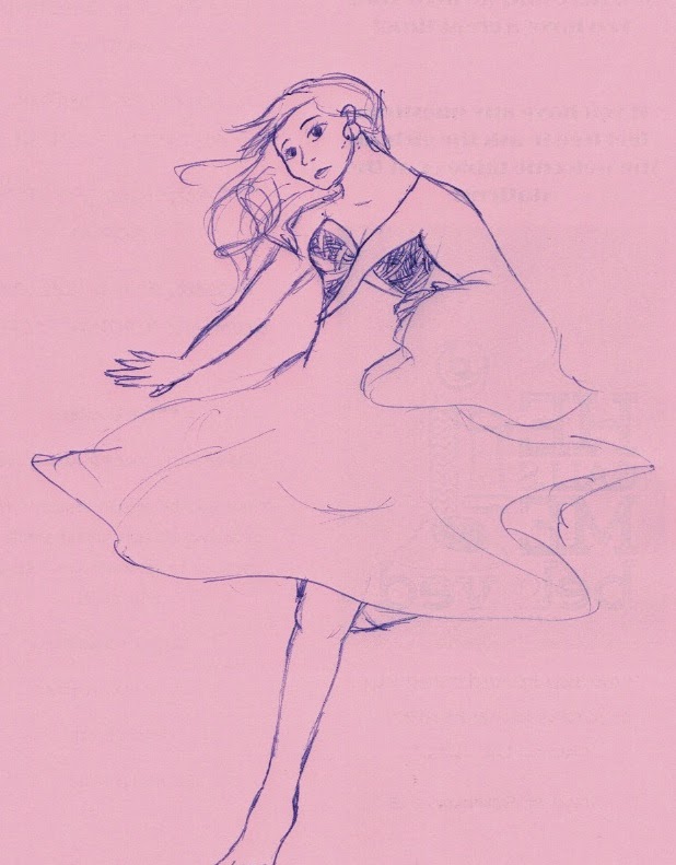
And I did this to see if I could still use markers:
(just pretend the wallpaper doesn't look ridiculous)
This is me attempting to do Bioshock fan art, but it's more like a precursor to something more polished. And inked.

Speaking of Bioshock: 
This is what happens when your professor introduces you to ADAMS software when you're on a gaming kick.

Also, some time ago it was "Draw your cat in a dress day" 
I did my best.

Here's a cute monster that I cannot replicate for the life of me.
Why must the cute ones be so hard to draw twice?

And if anyone looking at this happens to go to UAH, this never happened: 
The last class of the semester is rarely interesting, so I ended up drawing my circuits professor instead of paying attention. (Seriously, this never happened. I'm watching you.)
(Besides he smiles a lot more than this, neutral expressions are just easier for the first time with a face.) 

And that's all I had the motivation to track down.
I will try really hard to actually do some finished work and post it in the coming year.
(We'll just pretend engineering is not a time consuming major and that in my free time I won't be completely braindead.)
Welp
Later dudes,
~Allie

Thursday, May 8, 2014

Wall Art Progress (Thursday)

So, you may remember a while back I posted a picture of a chalk drawing on my wall?
Well, it's been a while, but I actually did some work on it!
The first coat is done, but the second is proving to be an issue. Turns out that rather than the very careful method I'd employed for the first coat will not get this thing done quickly. I am having to liberally slather paint on the areas I've worked on several times. This is making it go a bit slow since I want each section to be done before I work on the next. And after the tree, I have the text to do at the top.
At least I'm getting somewhere.
You may notice the distinct difference between the parts that only have one layer and the ones with more.
The text at the top is elvish for "Speak Friend and Enter" plus a little embellishment because I didn't want to go back, erase it, and center it. I chose to do that instead of the stars when they decided to be a huge pain in the neck to get right.
(Very geometric things look very wrong when there's only a slight issue.)

So I'm going to get back to working on this.
Go with God,
Allie

Monday, April 28, 2014

Finals (Monday)

Of course by "later this week" I meant in about two weeks.
Sorry for the delay, the semester's wrapping up and so things got particularly busy after that post. It's Finals week at last, and with inclement weather delaying tomorrow's final I found myself with time do scrounge up some of my more finished work from the semester.
This is brought to you by watching way too much Face Off.

Pen sketch I did at a campus ministry event. It looks off because I didn't have a pencil to do any basic proportioning with first.

And this was referenced from a picture in Hyrule Historia. I'm particularly fond of the environments from Skyward Sword, so I thought I'd take a stab at copying one of the concept sketches. Didn't turn out terrible, so it's here.

Once I move back home, get my desk set back up, and go through my notes I'll have some doodles to show you as well. I haven't been entirely idle this semester, I just haven't set aside much time for practice.
So sometime after next week I will post again.
(Hopefully it doesn't take me longer than a week to move back home.)
Go with God,
Allie

Thursday, April 10, 2014

I'm Alive! (Thursday)

Just wanted to let you know I'm alive and I have some sketches that I will scan later this week.
Sorry for the lack of updates.
Go with God,
~Allie

Monday, January 6, 2014

School Starts Wednesday (Monday)

So here's some art I've worked on recently.
(At least the more finished stuff.)


Just a note, my scanner's decided to start doing this thing where when the paper you're scanning isn't perfectly flat it shows these weird shadows where there aren't any.
I'm trying to think of a way to work around this.

Info:
The first is a magician concept. She's still in flux at this time, I really can't pin her down, but this has presented itself as an option.
The second is an odd character who, despite having been sitting around since before winter break has elected not to entirely reveal his true nature. However, his look is rather fixed at this point, so you get that.
The last is something I drew last night. She's one of the elemental judges; earth, if you couldn't figure that much out. Her leg is made of "living" branches because of backstory issues. Her coat, face, and figure I like, but I think the dress needs to change. Maybe.
And I just drew the little cute thing for my own entertainment. Thinking about giving the full one a quick color… maybe with pencils.

Go with God,
Allie

Thursday, October 31, 2013

Halloween (Thursday)

You didn't really think I'd pass up this sort of opportunity, right?

Well, our door decoration is up, but I haven't taken a picture yet.

HOWEVER.

I DID SOMETHING COOL AND I'M A LITTLE EXCITED?

IT'S NOT TOO OBVIOUS RIGHT?

Here's my Halloween costume!


It took 45 minutes, but the look on my Statics professor's face was worth every minute.
*evil cackle*

And thanks to a little forethought on my part, I took process photos!
(So if you're not terribly interested in how this masterpiece came together, you can go now.)

Step 1!
Outline your wounds:
I didn't really want large open wounds (because those take a lot more effort), so two slightly open slits and a closed cut seemed like enough. Also, now's a good time to put your eyeliner on. I used a dark brown for this step.
Bonus:
I included the neck cut to add an obviously not real element, so as not to scare the people who care too bad. The first time I tried this out, my roommate asked if there was anything we needed to talk about. Which was nice, but still something to be avoided.

Step 2!
Bruises:

I started with some yellow around the "cuts" and then blotted on the purple. Applying the purple this way makes it look more natural. Then I lightly put some green on the edges of each bruise, just for a more rounded look, but it's not entirely necessary. And don't forget the shadows under your eyes, particularly when including a nose wound!
This is probably the longest step, and it seems horribly simple for the amount of time put in, but it really isn't all that difficult.

Step 3!
Where we make use of white eyeliner and black lipstick:
For the white eyeliner, the key is to put it pretty much on or around the dark brown lines you started with. Also, if doing stitches, put dots where the thread "goes into" the skin. I would also recommend brushing a very light brown over the white so that it doesn't look as stark. This give more of an appearance of having broken skin.
For the black lipstick, put on a line on the bottom lip about where your lips meet and rub your lips together, then wipe off some. I also used some of the dark brown left over on my brush to do the drips from my mouth. This will make it look as though you've been either eating blood or coughing it up.
Yay!

Step 4!
Bring on the blood:
Ok, not a great picture, but still.
Now's the time to fill in those little gaps with a good amount of red. This is no time to be stingy, inside the wound needs to be dark. I also did a line of red over the neck line. (Adding a little trickle here and there makes for some really good reactions.) Also, anywhere you may have added "dry blood" (a.k.a. the dark brown near my mouth) brush a little red over it to get the right color.

Step 5!
Stitching it together:
Should have taken a close-up of this part.
Oh well.
Here you'll want black eyeliner to play connect-the-dots with the white spots you added earlier. Also adding a spot of red at the ends of your stitches makes them look cooler. 

And with that you're done, and ready to startle some unassuming teachers!
Almost makes me wish I had more classes today.

So have a Happy Halloween, and I'll post again sometime soon.

Go with God,
~Allie